On Bank of America, Wells Fargo & not being a hypocrite

Wells Fargo banker thinking up new fee strategies

I’ve been carping on my friends lately that they should dump Bank of America. Their latest scheme to extract money from their customers comes in the form of a $5 monthly fee for debit card use. I’m hoping the $5 monthly fee can be sufficient impetus to finally dump that shitty bank.

I’m a proponent of Arianna Huffington’s Move Your Money Project.  By proponent, I mean a booster: someone who touts the principle as one worth following. Though as much as I’ve touted the project, I still have an account at a national, too-big-to-fail bank: Wells Fargo.  I have my main accounts with Wells Fargo for the simple reason that there is a Wells Fargo ATM across the street and a Wells Fargo branch a block and a half away. This convenience is hard to give up, but I dislike being a hypocrite even more than giving up the convenience (and I do feel like having a Wells Fargo account makes me a bit of a hypocrite).

Since Wells Fargo is also planning on a debit card fee, I’ve decided it’s a great opportunity to open an account at a local credit union and move my money.

I have two to choose from, the San Francisco Federal Credit Union or the San Francisco Fire Credit Union.

The San Francisco Federal Credit Union has three stars on yelp and an ugly website, so they’re out.

The San Francisco Fire Credit Union has five stars on yelp and a pretty website, so I’m going with them. Also, I can sign up online! After fifteen minutes suffering though some seriously annoying user interface issues on their website, I have an account! Yay!

If you’re going to join me in moving to SF Fire Credit Union, I suggest you go into their branch. The new-account stuff on their website is frustrating and may turn you off.

Better version of this image

On the original, the two photos look terrible when adjacent to each other. This is exacerbated by the fact that the two images are not the same width.

I’ve fixed this by moving the images apart. That was sufficient. A small 3px white stroke around the inside of each made the fix even better.

I moved some stuff around and added a small quote, which I think makes it perfect:

NPR Streaming Media Window – UI suggestion

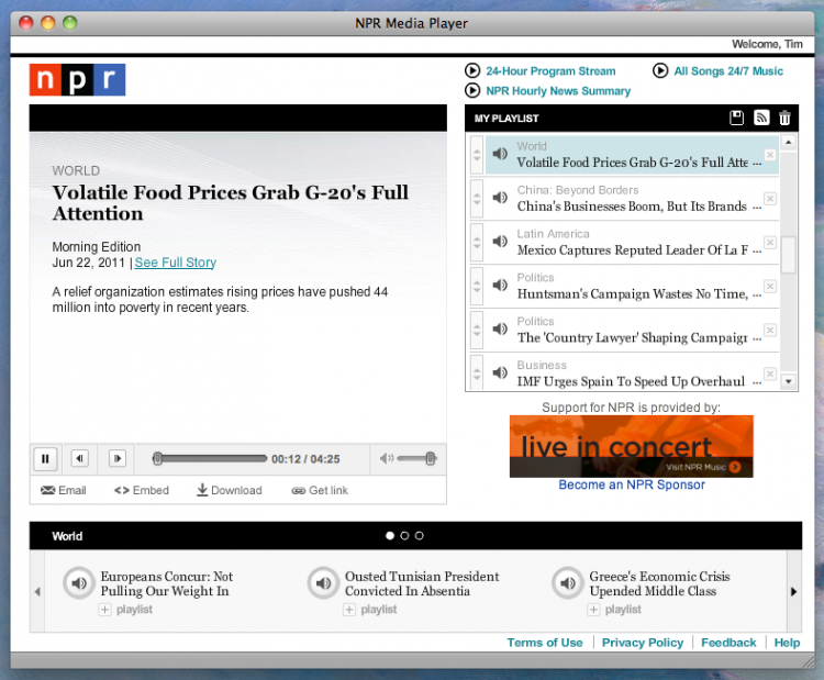
Here’s the original:

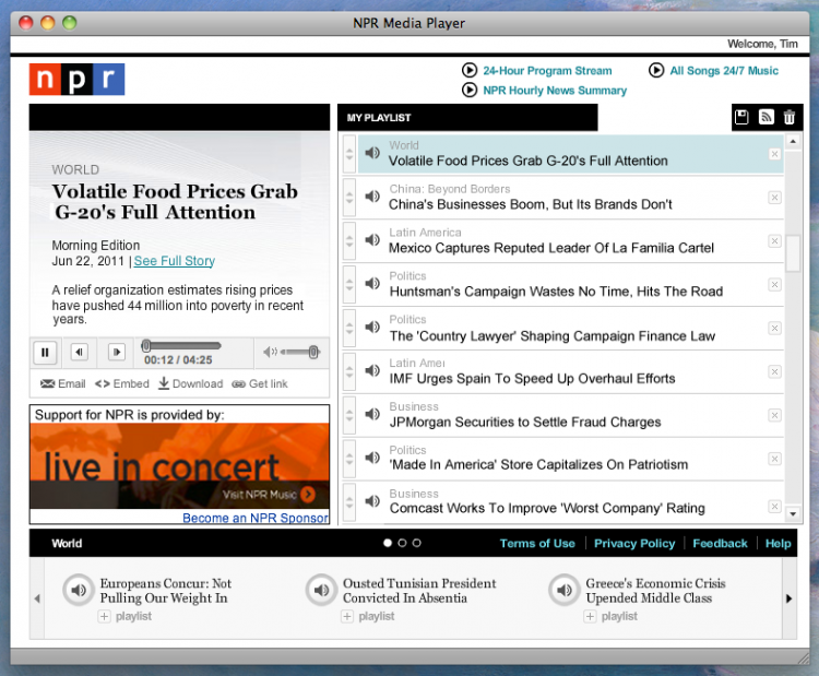
Here’s my suggestion:

The plusses are that there is much more space for titles in the streaming list. I can read the whole story without guessing what the story might be. I hate not knowing what the story is when I am building my playlist. This solves it.

I took space away from the “now playing” box. It’s useless, wasted space.

With this layout, there is more space for the sponsorship image.

Something to consider – the box at the bottom can probably be dispensed with, unless NPR has user data that says that area is used by users.

Bad UI at San Francisco Superior Court

Here’s an experiment:

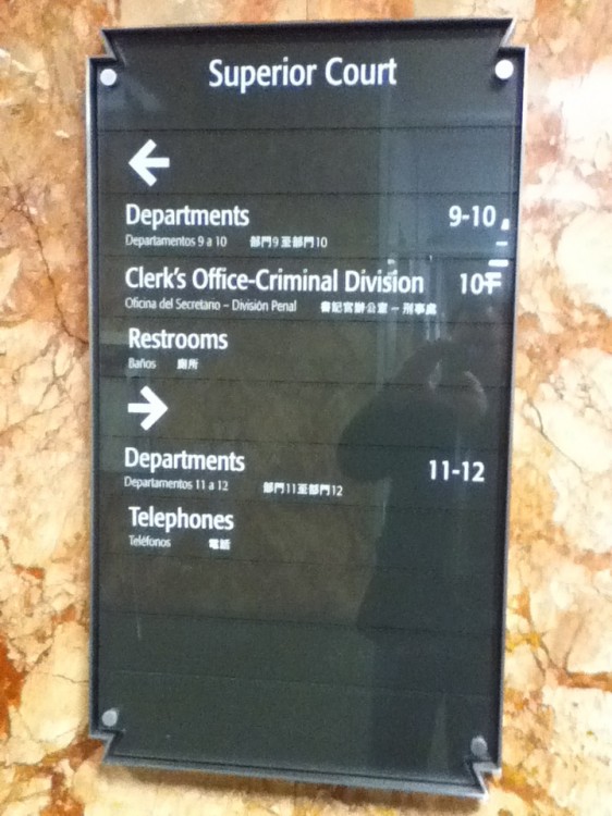
Imagine you have to go the bathroom really bad. You are walking and see this sign at the end of the all. Glance at it quickly. Do you go right or left?

I went right. Obiously, the arrow is right below Restroom—immediately adjacent, almost touching—so it must be to the right, right? No. It’s to the left. This is the sort of sign you have to read from top to bottom to understand.

If the person doing the letters had put one empty panel between the arrow and the word Restroom, this would not be confusing.

Chase Bank online security is scary-bad

An illustration of Chase Bank security

Users are slowly learning that using the same password on multiple sites opens them up to a lot of hackery if one of those sites is compromised. So how can a typical user (I think of my mom) easily create a new password for every site they visit?

Password managers! They’re great! Password managers keep all your logins and passwords in one place. They can generate new passwords for you and let you retrieve them easily and securely. I use KeepassX for my login and password storage management. I like it because it’s super easy to use and it’s a great way to organize my keys. I can’t imagine going back to memorization.

My favorite feature of KeepassX is the password generator. It generates passwords for me that are super-dooper strong, like, for example:

2wAn>Jy*2_-e;3(o}lBx`! g]

That’s a bit more secure than using dictionary words with a random l33t thrown in for good measure.

So, onto my point.

My roommates send me money through Chase Bank. It’s convenient and fast (in terms of getting the money) but it is not terribly secure. Chase Bank forces users (like me) to use a short, easy-to-guess password. I can’t use

ya~ >I@,3}(Z_-8VF$2k-Mr1>

because they don’t allow white spaces. I can’t use

wEjw_Gp”-BtEQ#)!a!e_SzV4Q

because they don’t allow special characters, minus or underline. I can’t use

MCviMc5M5605M57LwJxp4gO6B

because it’s too many characters. I have to shorten it down to eight characters. I’m feeling more naked and insecure with every attempt.

I called Chase to complain about this. They told me since I am not an account holder that they can’t even pass my complaint along to the web team. (basically, “go pound sand, Tim Wayne”).  Well, eff you, Chase Bank. Your website is insecure and your customers are needlessly exposed to hackery.